 |
Main Page Class Hierarchy Alphabetical List Compound List File List Compound Members
|
#include <FXButton.h>
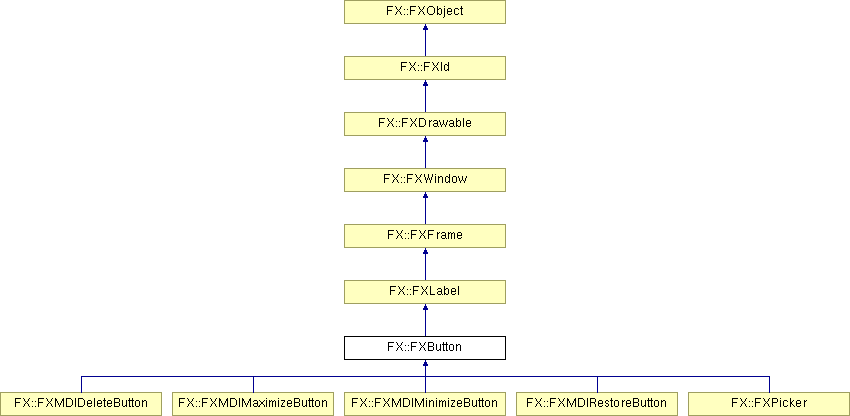
Inheritance diagram for FX::FXButton:

Public Member Functions | |
| FXButton (FXComposite *p, const FXString &text, FXIcon *ic=NULL, FXObject *tgt=NULL, FXSelector sel=0, FXuint opts=BUTTON_NORMAL, FXint x=0, FXint y=0, FXint w=0, FXint h=0, FXint pl=DEFAULT_PAD, FXint pr=DEFAULT_PAD, FXint pt=DEFAULT_PAD, FXint pb=DEFAULT_PAD) | |
| virtual FXbool | canFocus () const |
| virtual void | setFocus () |
| virtual void | killFocus () |
| virtual void | setDefault (FXbool enable=TRUE) |
| void | setState (FXuint s) |
| FXuint | getState () const |
| void | setButtonStyle (FXuint style) |
| FXuint | getButtonStyle () const |
When pressed, the button widget sends a SEL_COMMAND to its target. Passing the BUTTON_TOOLBAR style option gives buttons a "flat" look, and causes the edge of the button to be raised when the cursor moves over it. Passing BUTTON_DEFAULT allows the button to become the default button in a dialog, when the focus moves to it. The default widget in a dialog is the widget which will accept the RETURN key when it is pressed. The BUTTON_INITIAL flag makes the button the default widget when the focus moves to a widget which can not itself be a default widget. There should be only a single button in the dialog which is the initial default; typically this is the OK or CLOSE button. The option BUTTON_AUTOGRAY (BUTTON_AUTOHIDE) causes the button to be grayed out (hidden) if its handler does not respond to the SEL_UPDATE message. This is useful when messages are delegated, for example when using a multiple document interface, where the ultimaye destination of a message can be changed.
See also:
|
||||||||||||||||||||||||||||||||||||||||||||||||||||||||||||
|
Construct button with text and icon.
|
|
|
Returns true because a button can receive focus.
Reimplemented from FX::FXWindow. |
|
|
Move the focus to this window.
Reimplemented from FX::FXWindow. |
|
|
Remove the focus from this window.
Reimplemented from FX::FXWindow. |
|
|
Set as default button.
Reimplemented from FX::FXWindow. |
|
|
Set the button state.
|
|
|
Get the button state.
|
|
|
Set the button style flags.
|
|
|
Get the button style flags.
|
|
|